A New Paradigm for a Smartphone Camera Interface
(Cf. Joel Spolsky's User Interface Design for Programmers).
[Youtube: main interface / settings]
On a computer, certain things are just easy to do:
- you can easily move the mouse to any corner of the screen
- you can easily move to any edge of the screen
You don't have to think.

On a phone, there are also easy gestures:
- swiping up / down / left / right in the middle of the screen
- swiping up / down / left / right on the edge of the screen

It's not an accident that Apple has implemented many of them:
- swipe in the middle to dismiss a photo
- swipe up from the bottom edge to go home
- swipe right on the bottom edge to go to the previous app (and left to return)
- swipe down from the top left edge to see notifications
- swipe down from the top right edge to open control center
- swipe inward from the edges of the screen to navigate back/forwards
These are gestures that are hard to get wrong, but they have been forgotten when it comes to camera apps.
Most camera interfaces are difficult to use
Even though the iPhone is essentially a supercomputer that fits in your pocket, some of its most useful functions are hidden behind complex gestures.
Cropping in the native app involves either:
- physically turning the phone to landscape, or
- editing photos after taking them (not an option if you take many photos)
Zooming involves turning a fiddly wheel (which most people don't even know about). If you don't pay attention you can accidentally switch to a different shooting mode.
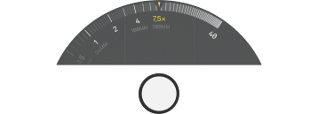
Changing the brightness in the iPhone camera app involves invoking a fiddly slider (that most people don't know about) and which frequently resets without being asked.

Changing the contrast is essentially impossible from the regular camera interface.
Applying an effect involves following a complex chain of steps to enable the effect, then the same complex chain of steps to turn it off.
For example, shooting a black-and-white photo is an 11 or 12-step process, depending on whether you want "Muted" or "Stark":
Now that you've taken a photo in black and white, would you like to go back to color? Guess what: 11 more steps.
And, all these gestures require you to pay close attention.
An easier interface
With an incredibly simple and intuitive interface, Phase aims to change the way we interact with our phone camera.

Phase uses the easiest, most natural gestures to help you compose the perfect photo:
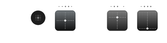
- slide up and down in the middle to crop
- slide up and down the right edge to zoom (contrast, brightness, exposure etc.)
- slide up and down the left edge to change contrast (brightness, exposure etc.)
To shoot a black-and-white photo, just tap the effect button — once for on, once for off. You can configure it to enable other effects.
Unobstructed feedback
When you slide your finger on the screen, Phase displays the changing value — on the opposite side of the screen where it's not blocked by your hand.

The feedback moves with the slider to differentiate it from other information on the screen.
Don't require unnecessary precision
The sliders invite you to crop or zoom — they're strong visual hints that you can drag your finger to change them.
But, Phase doesn't require that you touch the slider itself — dragging anywhere along the edge works just as well.

To change the crop slider, just drag up or down anywhere in the middle of the screen.
Icons you know
Lots of camera apps use custom icons for familiar functions, requiring you to take time to learn how to use the app.
But if you've used an iPhone camera for any amount of time, you immediately recognize these icons:

You should be able to use the app without having to memorize a new vocabulary. We'll leave the creativity to you.
Bright sunshine
Each generation of iPhone has a brighter screen than before. But it's still a challenge to read details on the screen in luminous conditions. This is what the iPhone camera looks like in direct sunlight:
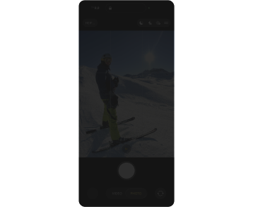
The controls already require attention but in harsh sunlight they become unusable.
Phase automatically turns on a special high-contrast mode when conditions are bright.
A non-invasive tutorial
We've made the Phase interface as easy as possible, but we also wanted to make it powerful.
People don't read tutorials — but they do look in the settings. So, we use the Settings screen to show you what's possible.
Simply seeing a setting like "Left Slider" tells you that it's possible to change what that slider does:
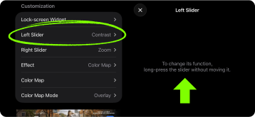
We could have (and did) put the choice of function in the setttings — but then we'd be encouranging to you develop a time-wasting habit. So, we just show you the shortcut.
We've used this technique throughout — a simple, customizable interface combined with Settings screens to show you what's possible.
Copy and paste vs. the photo picker
Initially we used the iPhone photo picker to select new Color Map images (dedicated page).
But then we realized that it's much faster to let the user just paste an image into Settings.
Long-press on any gradient on any web page or in your Photo Library and tap "Copy".
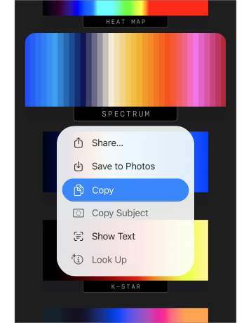
Then long-press the current color map in Settings and tap "Allow Paste":
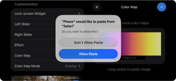
So much simpler, so much faster.
If you try Phase and find a new way we could make it easier to use — let us know!
Next: a tour of the Phase Settings!